5 Tips to improve Burn Up Charts for Agile Projects
Burn Up Charts are one of my favorite agile project management tools. If you are familiar with basic burn-up charts and want to up your game, then add these 5 tips to improve your Burn Up Charts.
1. Outline your objectives
Burn Up charts can offer a variety of flexible information options to an agile project manager. Instead of presenting a simple burn-up chart, it always makes sense to note down the key take-aways you want from your burn-up. Here are some of the Burn-up chart objectives that I often use -
- Identifying and managing scope creep
- Predicting story point velocity and agile delivery forecasts
- Resource Planning
- Planning release dates and governance activities
- Risk Management
Burn-up charts can easily be used to layer one or more of these pieces of information. Follow along to see a few examples in action.
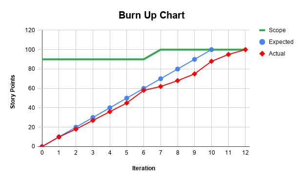
2. Identify Scope Creep in your Burn Up Chart
Agile projects are not immune to scope creep. Especially in Banking and Financial Services and other mature or regulated industries. You can use Burn-up charts to easily identify changes in scope.
Scope creed on a Burn-up chart is identified by kinks or shifts in the scope line. If the kink is upwards, it means that the scope has increased. If the kink is downwards, then some of the project goals have been removed.

Agile Tip: Conversations between Business stakeholders and development teams should be fair and balanced. Visualizing scope creep via Burn Up Charts early in the project, and often in the project, makes business partners more sensitive to risk and changes in delivery dates.
3. Adding velocity predictions and delivery forecasts
The chart below allows an Agile Project Manager to make educated forecasts regarding feature completion. In this case, the scope can be realistically completed in 12 to 13 sprints. If the team is able to increase its velocity, then they can optimistically finish in 11 sprints. However, there may be set back to velocity, and the feature may pessimistically take 16 sprints. Burn-up charts are better geared to working with forecasts, and therefore I often prefer them over burn-down charts.

Agile Tip: Reporting sprint velocity for velocity sake, is not beneficial or actionable. Using Burn-up charts for forecasting pushes business partners as well as the development team into action.
4. Use Sprint End Dates
Most burn-up charts, as in the examples above, show the x-axis as an iteration number. However, this simple hack, of changing iteration numbers to sprint end dates, has been one of the most useful tricks to improve my burn-up charts.

Agile Tip: Iteration numbers are not too relevant to anyone outside the development team. Business partners, for whom you are most likely making this chart, are more interested in when we can ship value to customers. Therefore use sprint end dates in place of iteration numbers where possible.
5. Indicate Agile Release Dates
This tip is more focused on banks and enterprises that do not release code after every sprint. If you are releasing code every 3 to 5 sprints, then it always helps to visualize the release dates on your burn-up charts.
By adding a Major Release date below, we are able to see that the Realistic Forecast gives us a margin of safety. However, the Pessimistic Forecast will force us to miss the release date.

Agile Tip: Shipping value to customers should be the most important focus of your agile teams. Use burn-up charts to highlight release dates and steer conversations and trade-offs with this ultimate goal for the organization.
Get the advanced Burn-Up Chart template
If you are interested in implementing these burn-up chart hacks, here is an advanced Burn-Up Chart template that I use.
---
I hope these hacks prove useful. Do let me know which tips worked for you. If you have other burn-up hacks, please share them in the comments and help others in the community.

Comments
Post a Comment