What is a Burn Up Chart in Scrum?
Burn-up charts are important visual tools that help Agile project teams manage their workload better. Surprisingly they are not as well understood or widely used as Burn-down charts.
Through this article, I hope you can understand what a Burn-up chart is and the unique advantages it offers an agile project manager.
What is a Burn-Up Chart?
A burn-up chart is a visual tool used in agile and Scrum projects. It is a graphical depiction of the work completed compared to the project scope. A burn-up chart provides information in a simple and easy manner on how much work was actually done in the previous sprints, and what can be forecasted in the upcoming sprints. Burn-up charts are valuable for tracking progress and estimating completion dates for projects that span multiple sprints.

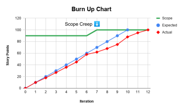
What do the Three Lines in the Burn-Up Chart mean?
- Scope / Goal
- This is a horizontal line depicting the total effort needed to complete the feature
- Usually represented as Story Points
- Any change in the level of the horizontal line indicate a change in scope
- Depicted in green in the chart above
- Expected Velocity
- This is a diagonal line from bottom left to the top right
- This is a control line that usually splits the total effort into equal velocity increments
- Depicted in blue in the chart above
- Actual Velocity
- This is a diagonal line that moves from the bottom left to the top right
- This line traces the actual velocity of the team; therefore may not be a straight line
- Depicted in red in the chart above
- When the slope of the line becomes flat, it means velocity has dropped
- When the slope of the line is steep or vertical, it means velocity has increased
- If the Actual Velocity line is below the Expected Velocity line, then the project is behind schedule
What is the difference between a Burn-up Chart and a Burn-down Chart?
| Parameter | Burn-up Chart | Burn-down Chart |
| Scope |
|
|
| Visualization |
|
|
| Advantage |
|
|
| Disadvantage |
|
|

Advantages of Burn-up Charts
- Gain a better view of the project goal
- They usually give you a multi-sprint view
- Helps in forecasting project or feature delivery
- Makes it easy to identify scope creep
- More intuitive since lines go from bottom left to the top right
- More information can be layered based on the team style (like optimistic and pessimistic estimates)

Comments
Post a Comment